Some of my other articles explain how to photograph your 2D artwork (and then what to do if your paintings turn out crooked or skewed) but in this tutorial I’m going to show you how to use Adobe Photoshop’s curves tool to fix photographs of your art that are all washed out.
And obviously the curves tool will work on any type of photo that needs more contrast and color, not just photographs of artwork, so feel free to use it whenever you want.
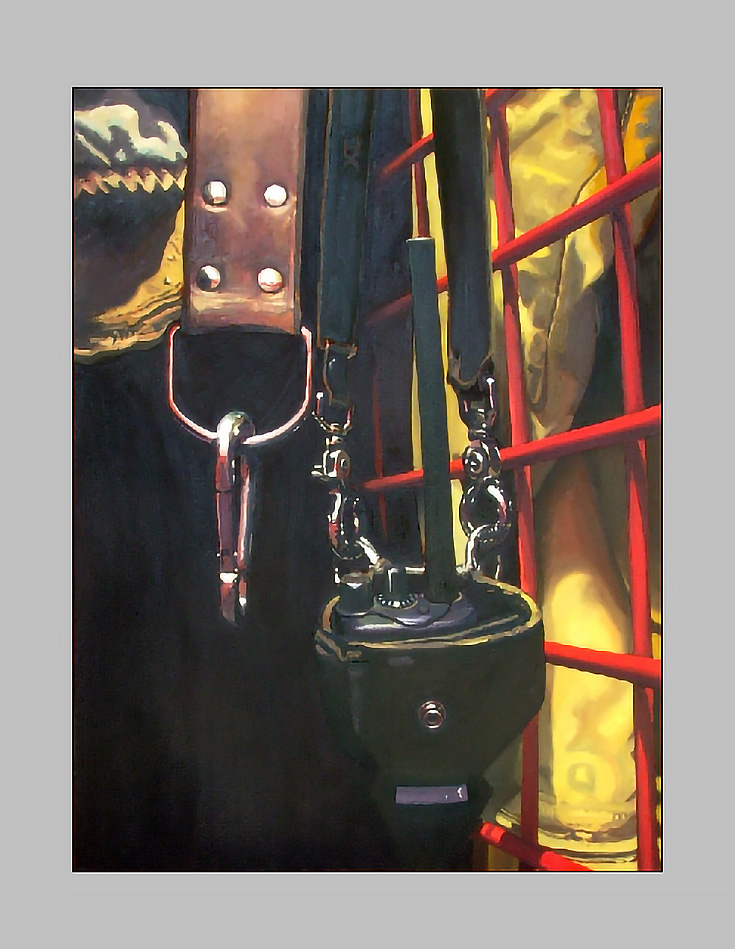
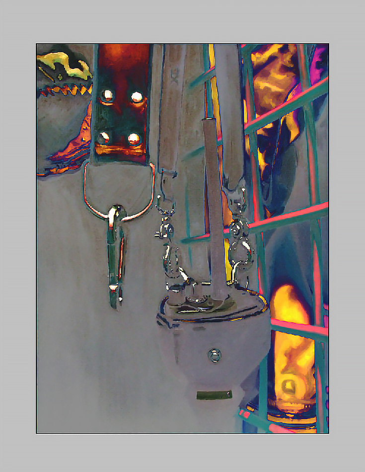
Here’s the photograph that I’ll be using as an example—pretty bad, isn’t it?
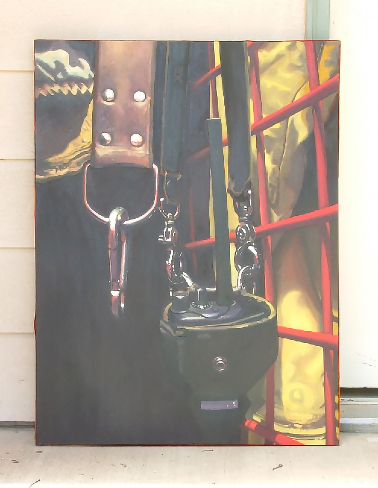
All the colors are grayed out and there aren’t even any real darks showing up. A photograph like this is definitely not portfolio material, but what if you had to use it? What if you’ve already sold the painting, it’s the only photo you’ve got and you HAVE to put it in your portfolio?
Well, first off you’d get the image into Photoshop and lose the background.
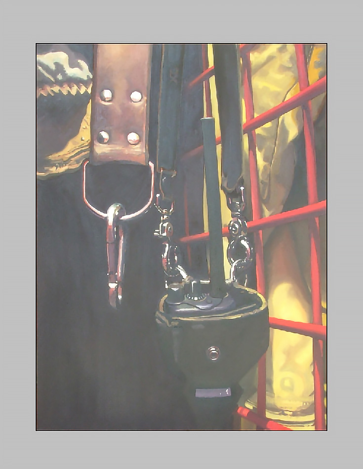
Honestly, until you isolate the painting from it’s surroundings, you might not really be able to see how bad it looks compared to the original.
Then go to “Image” in Photoshop’s menu bar and click on “Adjustments.” There are quite a few options to choose from, including “Brightness/Contrast,” “Color Balance” and “Levels.” Play around with those if you must, but whatever you do, don’t pick one of the three “Auto” adjustments I’ve crossed out.
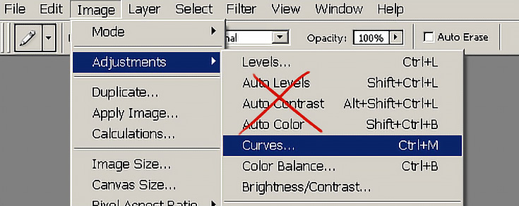
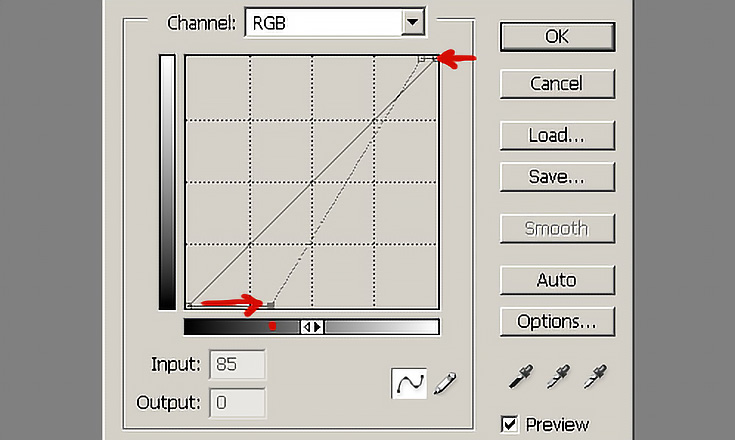
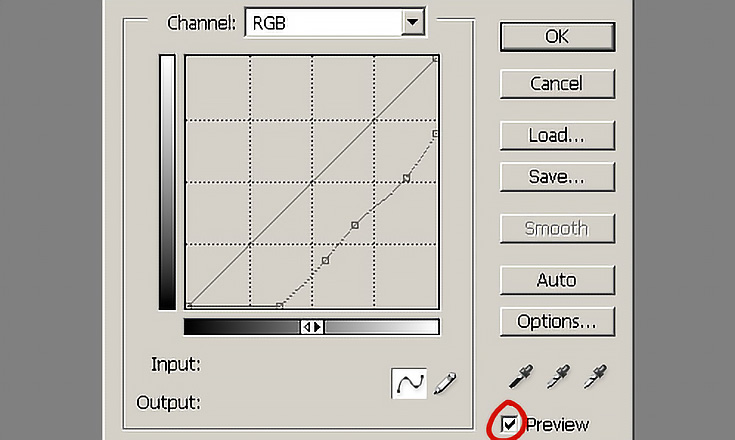
If you do, Photoshop will try its best, but it won’t be good enough (at least not for a photo this messed up.) Click on “Curves” instead, and you’ll get the box below, minus my red arrows and dots of course.
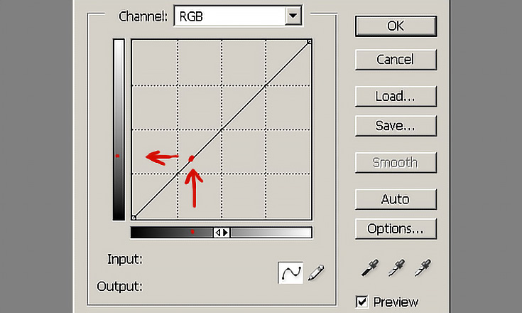
Now, the curves tool is fairly complex, but you can almost get by with just this bit of knowledge: that diagonal line controls every pixel in your image.
Just click and drag on the diagonal line, and you’ll find out what I mean.
You see, the gradient below the box represents the colors in your image as they are now (they’re called “input” colors), and the gradient to the left of the box represents what those colors WILL BE if you shift the line up or down (the “output” colors).
When you first open the curves tool, nothing has changed—any colors that started off 70% dark (where I put the red dot on the bottom gradient) still line up perfectly with 70% dark in the left gradient.
But push the corners of the line inward. . . and things start to change.
Now, any colors in your original image that ranged from 70% dark to 100% dark are ALL 100% dark (because the diagonal line matches them up differently than before). And any colors between 0% dark and 10% dark are ALL 0% dark.
Here’s what that steeper diagonal line makes my painting look like.
So it’s better, but it’s not as good as it needs to be. In fact, that’s pretty much what Photoshop’s “Auto Levels” or “Auto Contrast” would do for me.
The curves tool can still do so much more. . . for example, try clicking and dragging a point on the diagonal line downward a bit.
This curve creates a much more gradual change in the colors of the image. I’d say it’s almost normal, although some of the dark areas still look a little “cloudy” and the colors are a bit intense for my taste.
So what happens if you make multiple curves? Try it. (Just click on the line again when you want to create a new curve.) It might look something like this.
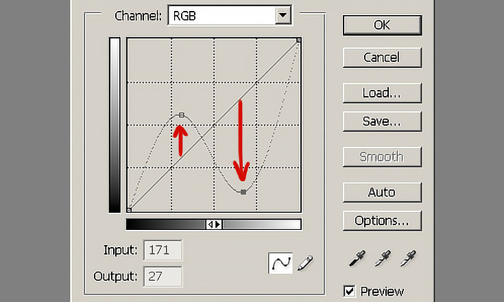
That s-curve made a lot of the dark colors in my painting lighter, and a lot of the light colors darker. The image is basically inverted.
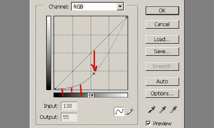
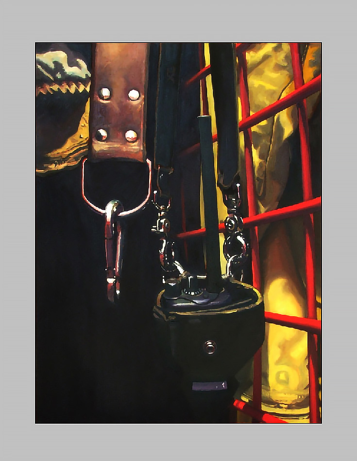
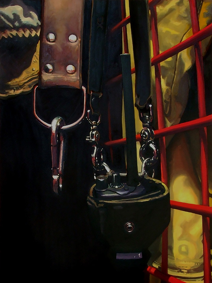
But enough fooling around. . . to fix my photo, I used the rather wobbly line below—you can see it’s shifted down and to the right of the original.
I started with that first downward curve, and then just tweaked the line until my painting looked right. (I had the preview button on, of course.)
It’s not absolutely perfect, but it’s a whole lot better than it was.
Hopefully that gives you some idea of how the curves tool works. It’s not an easy thing to explain in full, but as long as you know the basics you can pick it up pretty fast.
By the way, for most images, I simply push the top and bottom of the diagonal line inward, and then add a slight curve to the line. Only with especially tough photos (like this one) will you need multiple points on the line.
This post may contain affiliate links.